目錄

安斯庫姆四重奏

封面圖片是由 ChatGPT 所生成的安斯庫姆四重奏,提示詞為 “The digital design highlights the title ‘Anscombe’s Quartet’ in bold, white sans-serif letters, centered against a dynamic abstract backdrop. The image is split into four colorful quadrants, each showcasing unique textures and patterns—ranging from painterly hues and curved lines to scattered circles and dots.” 。

前言

今天在聽取報告時,偶然聽見一個名詞——安斯庫姆四重奏(Anscombe’s quartet),這是一個我從未聽說過的詞,但卻與統計學與資料視覺化有著重要的影響。

歷史

安斯庫姆四重奏是由英國統計學家弗蘭克·安斯庫姆(Francis Anscombe)於西元 1973 年建構出來的四組數據,而這四組數據擁有近乎相同的統計特性,但卻在圖形表現上有著天壤之別。

安斯庫姆四重奏

安斯庫姆四重奏的四組數據值如下,每一組都有 11 對 $x$ 和 $y$ 值:

$x_1$$y_1$$x_2$$y_2$$x_3$$y_3$$x_4$$y_4$
10.08.0410.09.1410.07.468.06.58
8.06.958.08.148.06.778.05.76
13.07.5813.08.7413.012.748.07.71
9.08.819.08.779.07.118.08.84
11.08.3311.09.2611.07.818.08.47
14.09.9614.08.1014.08.848.07.04
6.07.246.06.136.06.088.05.25
4.04.264.03.104.05.3919.012.50
12.010.8412.09.1312.08.158.05.56
7.04.827.07.267.06.428.07.91
5.05.685.04.745.05.738.06.89

我們使用 R 語言將以上的數據集進行簡單的分析。

輸入資料

如下,我們將上述的數據集輸入 R 語言,同時寫為矩陣形式,方便簡化操作。

 1
 2
 3
 4
 5
 6
 7
 8
 9
10
11
12
13
14
15
16
17
18
19
20
21
22
23
24
25
26
# dataset 1
x1 <- c(10.0, 8.0, 13.0, 9.0, 11.0, 14.0, 6.0, 4.0, 12.0, 7.0, 5.0)
y1 <- c(8.04, 6.95, 7.58, 8.81, 8.33, 9.96, 7.24, 4.26, 10.84, 4.82, 5.68)

# dataset 2
x2 <- c(10.0, 8.0, 13.0, 9.0, 11.0, 14.0, 6.0, 4.0, 12.0, 7.0, 5.0)
y2 <- c(9.14, 8.14, 8.74, 8.77, 9.26, 8.10, 6.13, 3.10, 9.13, 7.26, 4.74)

# dataset 3
x3 <- c(10.0, 8.0, 13.0, 9.0, 11.0, 14.0, 6.0, 4.0, 12.0, 7.0, 5.0)
y3 <- c(7.46, 6.77, 12.74, 7.11, 7.81, 8.84, 6.08, 5.39, 8.15, 6.42, 5.73)

# dataset 4
x4 <- c(8.0, 8.0, 8.0, 8.0, 8.0, 8.0, 8.0, 19.0, 8.0, 8.0, 8.0)
y4 <- c(6.58, 5.76, 7.71, 8.84, 8.47, 7.04, 5.25, 12.50, 5.56, 7.91, 6.89)

# collactions
x = cbind(x1, x2, x3, x4)
y = cbind(y1, y2, y3, y4)

# print
cat('x:\n')
print(x)

cat('y:\n')
print(y)
執行結果參考
 1
 2
 3
 4
 5
 6
 7
 8
 9
10
11
12
13
14
15
16
17
18
19
20
21
22
23
24
25
26
x:
      x1 x2 x3 x4
 [1,] 10 10 10  8
 [2,]  8  8  8  8
 [3,] 13 13 13  8
 [4,]  9  9  9  8
 [5,] 11 11 11  8
 [6,] 14 14 14  8
 [7,]  6  6  6  8
 [8,]  4  4  4 19
 [9,] 12 12 12  8
[10,]  7  7  7  8
[11,]  5  5  5  8
y:
         y1   y2    y3    y4
 [1,]  8.04 9.14  7.46  6.58
 [2,]  6.95 8.14  6.77  5.76
 [3,]  7.58 8.74 12.74  7.71
 [4,]  8.81 8.77  7.11  8.84
 [5,]  8.33 9.26  7.81  8.47
 [6,]  9.96 8.10  8.84  7.04
 [7,]  7.24 6.13  6.08  5.25
 [8,]  4.26 3.10  5.39 12.50
 [9,] 10.84 9.13  8.15  5.56
[10,]  4.82 7.26  6.42  7.91
[11,]  5.68 4.74  5.73  6.89

平均值、變異數與相關係數

接下來我們檢查這筆數據的的平均值、變異數與相關係數。

我們發現了一個有趣的事實,這些數據的平均值、變異數至少到小數點後第 2 位都相同。而每一組成對的數據間,如 $(x_1, y_1)$,它們各組的相關係數也同樣至少到小數點後第 2 位都相同。

 1
 2
 3
 4
 5
 6
 7
 8
 9
10
11
12
13
# means
cat('means:\n')
colMeans(x)
colMeans(y)

# variances
cat('variances:\n')
apply(x, 2, var)
apply(y, 2, var)

# correlation coefficients
cat('correlation coefficients:\n')
cor(x, y)
執行結果參考
 1
 2
 3
 4
 5
 6
 7
 8
 9
10
11
12
13
14
15
16
means:
x1 x2 x3 x4 
 9  9  9  9 
      y1       y2       y3       y4 
7.500909 7.500909 7.500000 7.500909 
variances:
x1 x2 x3 x4 
11 11 11 11 
      y1       y2       y3       y4 
4.127269 4.127629 4.122620 4.123249 
correlation coefficients:
           y1         y2         y3         y4
x1  0.8164205  0.8162365  0.8162867 -0.3140467
x2  0.8164205  0.8162365  0.8162867 -0.3140467
x3  0.8164205  0.8162365  0.8162867 -0.3140467
x4 -0.5290927 -0.7184365 -0.3446610  0.8165214

線性迴歸

接下來我們對這四組數據進行迴歸分析,我們會發現這四組竟然都有相似的迴歸方程

$$ y = 3 + 0.5 x. $$

 1
 2
 3
 4
 5
 6
 7
 8
 9
10
11
12
13
14
15
16
lm1 <- lm(y1 ~ x1)
lm2 <- lm(y2 ~ x2)
lm3 <- lm(y3 ~ x3)
lm4 <- lm(y4 ~ x4)

coefficients_matrix <- rbind(
  coef(lm1),
  coef(lm2),
  coef(lm3),
  coef(lm4)
)

rownames(coefficients_matrix) <- c("lm1", "lm2", "lm3", "lm4")
colnames(coefficients_matrix) <- c("Intercept", "Slope")

coefficients_matrix
執行結果參考
1
2
3
4
5
    Intercept     Slope
lm1  3.000091 0.5000909
lm2  3.000909 0.5000000
lm3  3.002455 0.4997273
lm4  3.001727 0.4999091

這個巧合實在是太不可思議。到這裡,如果沒有檢查其它的統計性質,或許我們會認為這四組數據其實大差不差。但其實,這四組數據卻擁有截然不同的圖形,這些統計性質的相似只是巧合。
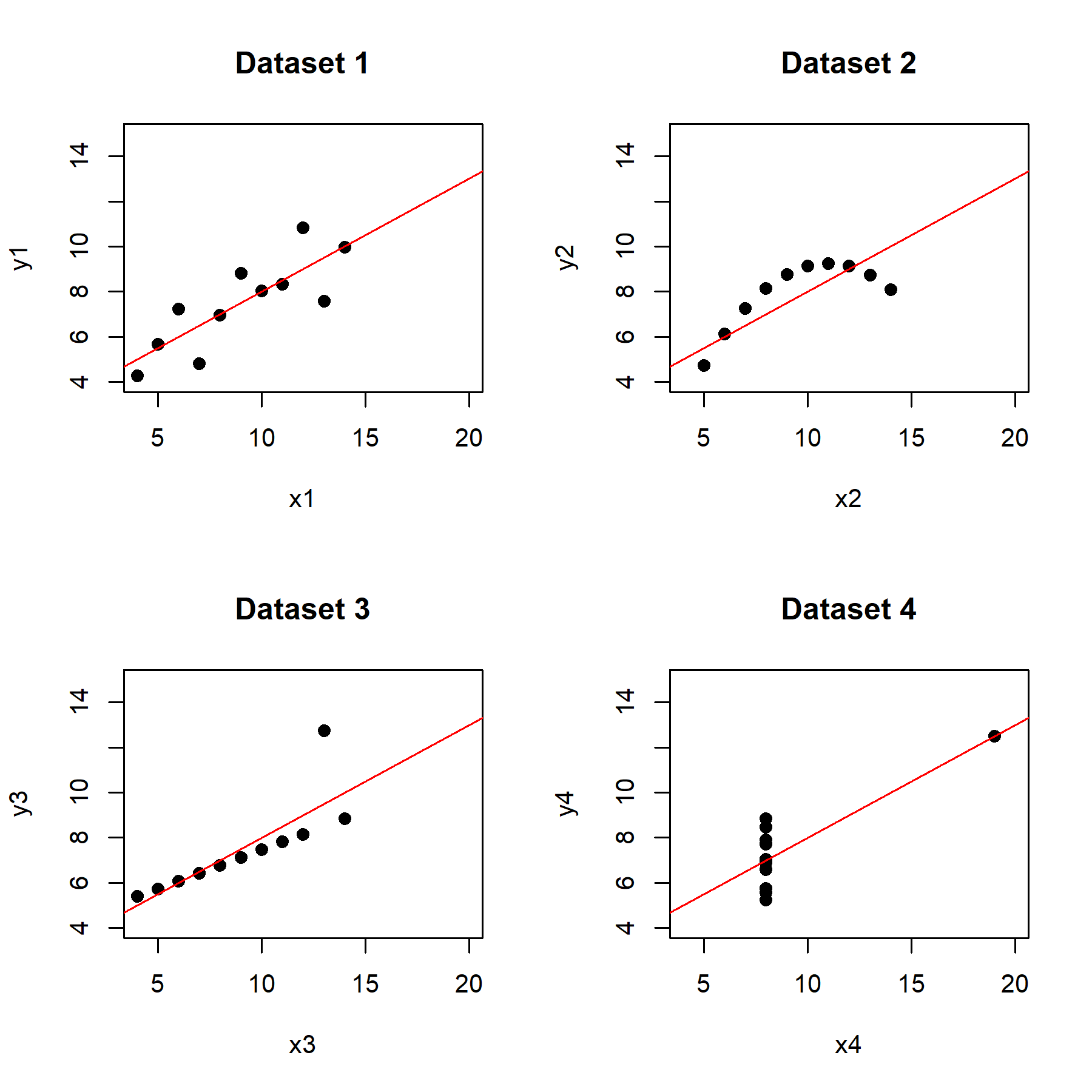
散佈圖

以下畫出這四組數據的散佈圖。我們可以從中發現第一組數據比較像是線性迴歸,兩種變量間存在著某種相關性;而第二組數據則可以很明顯地看到兩種變量之間存在著非線性關係;在第三與第四組數據中,可以很明顯地看到其各自存在一個離群值,使得這兩組數據的迴歸線受到影響。
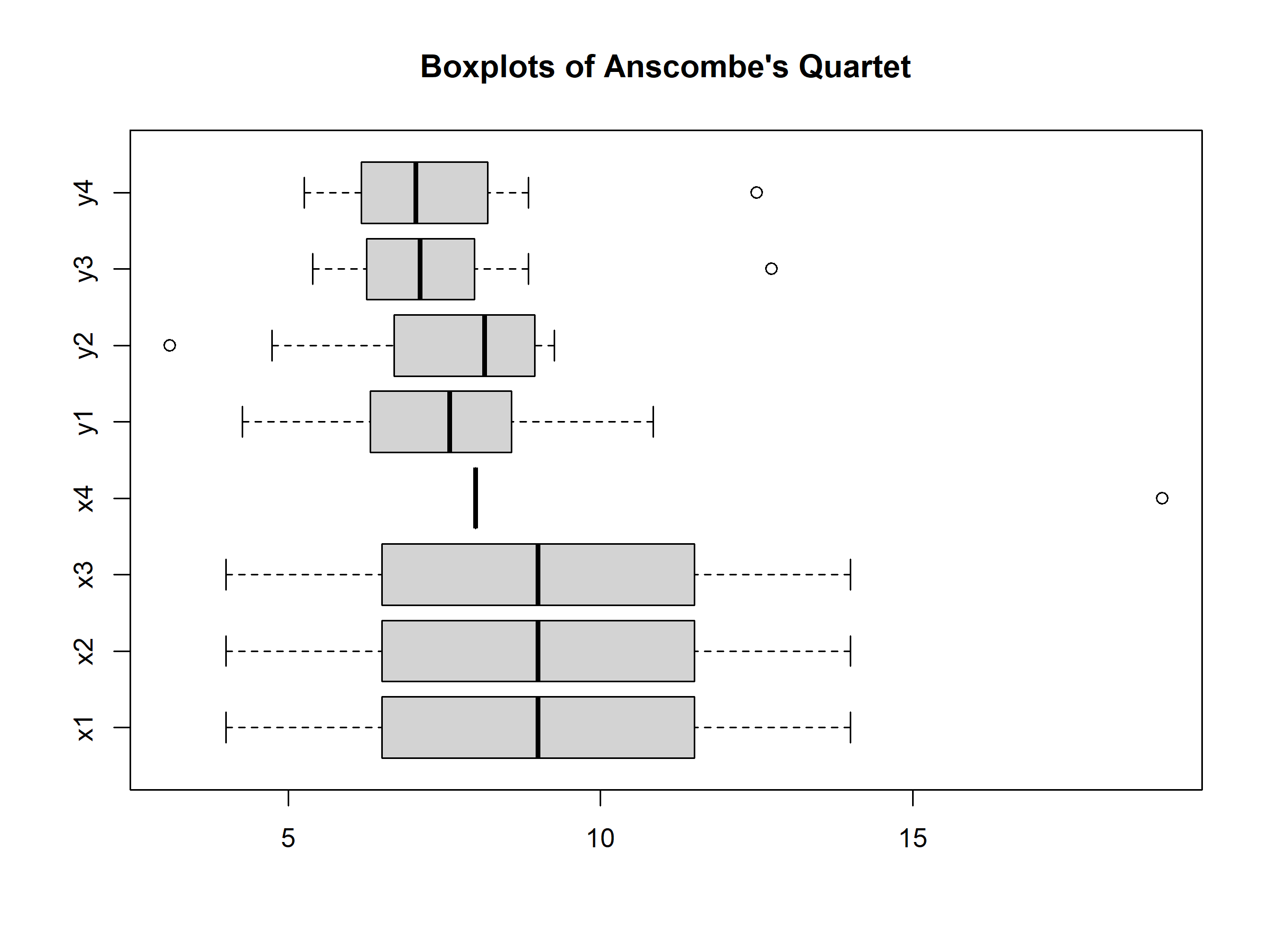
 1
 2
 3
 4
 5
 6
 7
 8
 9
10
11
12
13
par(mfrow = c(2, 2))

plot(x1, y1, main = "Dataset 1", pch = 19)
abline(lm1, col = "red")

plot(x2, y2, main = "Dataset 2", pch = 19)
abline(lm2, col = "red")

plot(x3, y3, main = "Dataset 3", pch = 19)
abline(lm3, col = "red")

plot(x4, y4, main = "Dataset 4", pch = 19)
abline(lm4, col = "red")

https://raw.githubusercontent.com/Josh-test-lab/website-assets-repository/main/posts/Anscombe's%20quartet/R/anscombe_scatterplot.png
四組數據的散佈圖與其各自的迴歸線。

盒狀圖

而從盒狀圖中,我們可以發現這四組數據的四分位數其實就有所不同。

1
2
3
4
boxplot(cbind(x, y),
        main = "Boxplots of Anscombe's Quartet",
        horizontal = TRUE
)

https://raw.githubusercontent.com/Josh-test-lab/website-assets-repository/main/posts/Anscombe's%20quartet/R/anscombe_boxplot.png
四組數據的盒狀圖。

結語

安斯庫姆四重奏說明了進行資料分析時,我們不能夠只單純依靠計算所得到的資訊進行判讀,更應該藉由不同的資料觀,如資料的視覺化、不同的分析方式,更全面地檢視手中的資料。統計數字固然重要,但若不搭配不同的分析方式,可能會大大誤判資料的真實意義。

延伸學習

參考資料