封面圖片為 ChatGPT 生成的關於資料分析的圖片,提示詞為 “A modern data analysis concept illustration featuring a futuristic workspace. The image includes multiple data charts, graphs, and dashboards displayed on transparent holographic screens. A diverse team of analysts and data scientists collaborate, analyzing trends and insights on large monitors. The scene has a sleek, high-tech atmosphere with glowing blue and purple hues, reflecting a professional and cutting-edge environment.” 。
前言 本次使用的資料集為 Swiss bank notes ,是銀行間用於判斷舊瑞士法郎(Franc)的資料集。本文自 https://github.com/QuantLet/MVA/tree/master/QID-1530-MVAscabank56 中下載 bank2.dat 資料集,並使用 R 語言進行分析。
資料集 由教科書 中,我們可以知道此資料集前 100 筆資料為真鈔(Genuine),後 100 筆資料為偽鈔(Counterfeit),共 200 筆資料, 6 個變數。
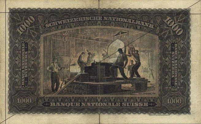
變數說明 舊瑞士 1000 法郎。
由表 22.3 ,我們可以知道資料集共有 6 個變數,每個變數說明如下:
變數 說明 $X_1$ 鈔票長度 $X_2$ 鈔票左側的高度 $X_3$ 鈔票右側的高度 $X_4$ 內框到下邊界的距離 $X_5$ 內框到上邊界的距離 $X_6$ 對角線長度
我們使用 R 讀取資料,並新增一個變數 genuine 表明是否為真鈔。其中, 1 為真鈔, 0 為偽鈔。使用的程式碼如下。
1
2
3
4
5
data = read.table ( 'bank2.dat' )
colnames ( data ) = c ( 'X1' , 'X2' , 'X3' , 'X4' , 'X5' , 'X6' )
data = data.frame ( data , genuine = c ( rep ( 1 , 100 ), rep ( 0 , 100 )))
attach ( data )
head ( data )
資料集 資料集部份資訊如下。
X1 X2 X3 X4 X5 X6 genuine 214.8 131.0 131.1 9.0 9.7 141.0 1 214.6 129.7 129.7 8.1 9.5 141.7 1 214.8 129.7 129.7 8.7 9.6 142.2 1 214.8 129.7 129.6 7.5 10.4 142.0 1 215.0 129.6 129.7 10.4 7.7 141.8 1 215.7 130.8 130.5 9.0 10.1 141.4 1 … … … … … … …
摘要 (summary) 我們可以使用以下程式碼簡單檢視資料集。
1
2
3
4
5
print ( 'Quartiles:' )
summary ( data )
print ( 'NAs:' )
sapply ( data , function ( x ) sum ( is.na ( x )))
資料集簡單摘要如下。
 1
 2
 3
 4
 5
 6
 7
 8
 9
10
11
12
[ 1] "Quartiles:"
X1 X2 X3 X4 X5 X6 genuine
Min. :213.8 Min. :129.0 Min. :129.0 Min. : 7.200 Min. : 7.70 Min. :137.8 Min. :0.0
1st Qu.:214.6 1st Qu.:129.9 1st Qu.:129.7 1st Qu.: 8.200 1st Qu.:10.10 1st Qu.:139.5 1st Qu.:0.0
Median :214.9 Median :130.2 Median :130.0 Median : 9.100 Median :10.60 Median :140.4 Median :0.5
Mean :214.9 Mean :130.1 Mean :130.0 Mean : 9.418 Mean :10.65 Mean :140.5 Mean :0.5
3rd Qu.:215.1 3rd Qu.:130.4 3rd Qu.:130.2 3rd Qu.:10.600 3rd Qu.:11.20 3rd Qu.:141.5 3rd Qu.:1.0
Max. :216.3 Max. :131.0 Max. :131.1 Max. :12.700 Max. :12.30 Max. :142.4 Max. :1.0
[ 1] "NAs:"
X1 X2 X3 X4 X5 X6 genuine
0 0 0 0 0 0 0
由上述回應可知,此資料集無缺失值。
相關係數 (correlation coefficient) 相關係數是用於測量兩個變數之間線性相關性的方法,其計算方式如下。
$$
\rho_{X, Y} = \frac{cov(X, Y)}{\sigma_X \sigma_Y} = \frac{E \left[ (X - \mu_X )(Y - \mu_Y) \right]}{\sigma_X \sigma_Y},
$$
其中,$cov(X, Y)$ 是 $X$ 和 $Y$ 的共變異數, $\mu_X$ 和 $\mu_Y$ 分別是 $X$ 和 $Y$ 的母體平均值,$\sigma_X$ 和 $\sigma_X$ 分別是 $X$ 和 $Y$ 的變異數。
以上我們都稱為母體相關係數 。在一連串的資料集中,藉由估算樣本的共變異數和標準差,我們可以得到樣本相關係數 ,其計算方式如下。
$$
r = \frac{\sum_{i=1}^n(X_i - \bar{X})(Y_i - \bar{Y})}{\sqrt{\sum_{i=1}^n(X_i - \bar{X})^2} \sqrt{\sum_{i=1}^n(Y_i - \bar{Y})^2}}
= \frac{1}{n - 1}\sum_{i=1}^n \left(\frac{(X_i - \bar{X})}{\sigma_X}\right) \left(\frac{(Y_i - \bar{Y})}{\sigma_Y}\right),
$$
其中, $X_i$ 和 $Y_i$ 代表資料集中第 $i$ 個樣本的數值, $\bar{X}$ 和 $\bar{Y}$ 分別是 $X$ 和 $Y$ 的樣本平均值。
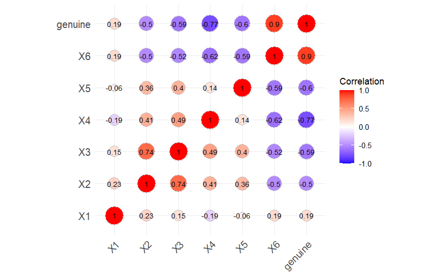
在 R 中,可以使用 cor(資料集) 生成每個變數間的相關係數,也可以使用不同套件(packages)將相關係數視覺化。以下使用 ggcorrplot 套件視覺化相關係數圖,除了將相關係數顯示出來,也依相關性顯示為藍色(負相關)與紅色(正相關),且相關性越大的點會越大,相關性接近 0 的點會變小。
 1
 2
 3
 4
 5
 6
 7
 8
 9
10
11
12
13
library ( ggcorrplot )
cor_matrix = cor ( data )
ggcorrplot ( cor_matrix ,
method = "circle" ,
type = "full" ,
lab = TRUE ,
lab_size = 3 ,
colors = c ( "blue" , "white" , "red" ),
outline.color = "gray" ,
legend.title = "Correlation" ,
show.legend = TRUE )
Swiss bank notes 的相關係數圖。
從上圖可以看到, $X_6$ 對於判別真鈔與偽鈔有很強烈的正相關姓,而 $X_1$ 則表現出較無線性相關性。
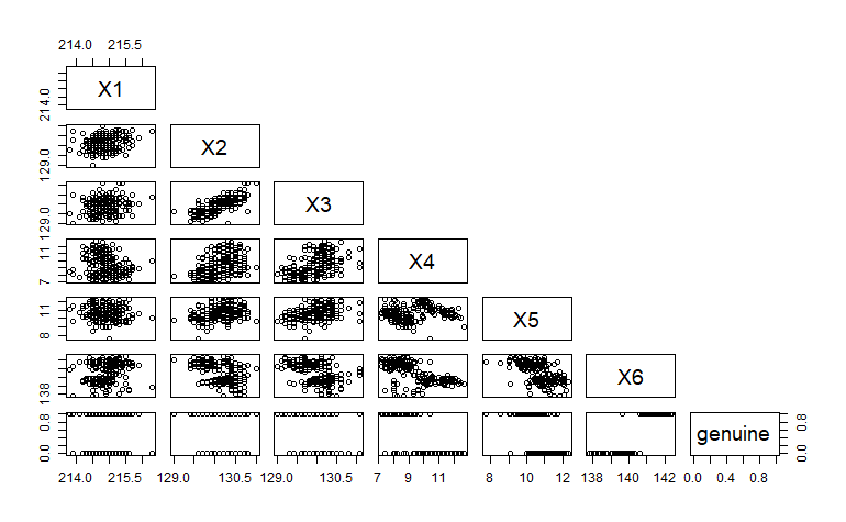
散佈圖 (scatter plot) 散佈圖是查看資料最簡單的方法,可以使用 plot(x座標, y座標) 輕鬆畫出散佈圖。如果有許多變數,使用 pairs 可以依每 2 組變數畫出散佈圖,使用方法如下。
1
pairs ( data , upper.panel = NULL )
Swiss bank notes 的 pairs 散佈圖。
我們可以從上圖中看到, $X_2, X_3, X_4, X_5, X_6$ 彼此間似乎存在線性關係,而 $X_1$ 與其他變數的關係並不是很強烈。且因為 genuine 是類別型變數,所以 genuine 與其他變數的交互始終位於 0 與 1 。
二維散佈圖 當然,我們也可以為每對變數個別繪製散佈圖。以下將各組資料兩兩單獨畫出散佈圖,並使用 genuine 變數為真鈔與偽鈔標示出不同的顏色。
 1
 2
 3
 4
 5
 6
 7
 8
 9
10
11
12
13
14
pairs_plot = function ( x , y , x_name , y_name ){
par ( mar = c ( 5 , 5 , 4 , 10 ))
plot ( x , y , main = "Swiss bank notes" , xlab = x_name , ylab = y_name )
points ( x[1 : 100 ] , y[1 : 100 ] , col = "blue" )
points ( x[101 : 200 ] , y[101 : 200 ] , col = "red" )
legend ( "topright" , legend = c ( "Genuine" , "Counterfeit" ), col = c ( "blue" , "red" ), pch = 1 , xpd = TRUE , inset = c ( -0.3 , 0 ))
}
num = combn ( 1 : 6 , 2 )
for ( i in 1 : ncol ( num )) {
x = paste0 ( "X" , num[1 , ][i] )
y = paste0 ( "X" , num[2 , ][i] )
pairs_plot ( get ( x ), get ( y ), x , y )
}
我們可以得到以下散佈圖。
gallery_made_with_nanogallery2-1-scatterplot
從以上成對的散佈圖中,我們可以發現某些圖,如 $X_1$ 和 $X_2$ 、 $X_1$ 和 $X_3$ 、 $X_1$ 和 $X_5$ 、 $X_2$ 和 $X_5$ 等,其邊界非常模糊,在判別真鈔與偽鈔時沒有辦法以清楚的分界線區隔;而 $X_2$ 和 $X_6$ 、 $X_3$ 和 $X_6$ 、 $X_4$ 和 $X_5$ 、 $X_4$ 和 $X_6$ 、 $X_5$ 和 $X_6$ 等圖則表現了較為明顯的區隔,如果使用這些成對的變數,較能夠區別出真鈔與偽鈔。
使用以上區隔較明顯的散佈圖,可以嘗試使用決策樹模型(Decision Tree)、 支援向量機(Support Vector Machine, SVM)、 K-近鄰演算法(K-Nearest Neighbors, KNN)等方法分類及預測新的鈔票(資料)是否為真鈔。
三維散佈圖 我們也可以繪製三維的散佈圖,具體程式碼如下。
 1
 2
 3
 4
 5
 6
 7
 8
 9
10
11
12
13
14
15
16
17
18
19
20
21
22
23
24
25
26
27
28
29
30
31
32
33
34
35
36
37
38
39
40
41
42
43
44
45
46
47
48
49
50
51
52
53
54
55
56
57
58
59
60
61
library ( lattice )
library ( grid )
groups = data[ , 7 ]
pch_types = c ( 1 , 1 )
colors = c ( "blue" , "red" )
pch_group = pch_types [ifelse ( groups == 0 , 1 , 2 ) ]
col_group = colors [ifelse ( groups == 0 , 1 , 2 ) ]
combos = combn ( 1 : 6 , 3 )
n_rows = 1
n_cols = 1
plots_per_page = n_rows * n_cols
for ( page in seq ( 1 , ncol ( combos ), by = plots_per_page )) {
grid.newpage ()
for ( i in 0 : ( plots_per_page - 1 )) {
index = page + i
if ( index > ncol ( combos )) break
x_name = paste0 ( "X" , combos[1 , index] )
y_name = paste0 ( "X" , combos[2 , index] )
z_name = paste0 ( "X" , combos[3 , index] )
x_data = data[[x_name]]
y_data = data[[y_name]]
z_data = data[[z_name]]
p = cloud ( z_data ~ x_data * y_data ,
pch = pch_group ,
col = col_group ,
cex = 1.2 ,
ticktype = "detailed" ,
main = paste ( "Swiss bank notes:" , x_name , y_name , z_name ),
screen = list ( z = -90 , x = -90 , y = 45 ),
scales = list ( arrows = FALSE , col = "black" , distance = 1 , cex = 0.5 ),
xlab = list ( x_name , rot = -10 , cex = 1.2 ),
ylab = list ( y_name , rot = 10 , cex = 1.2 ),
zlab = list ( z_name , rot = 90 , cex = 1.1 ),
par.settings = list (
axis.line = list ( col = "black" ),
box.3d = list (
col = c (
"black" , "transparent" , "transparent" , "black" , "black" , "transparent" , "transparent" , "transparent" ,
"transparent" , "transparent" , "transparent" , "transparent" ))),
key = list (
space = "right" ,
points = list ( pch = pch_types , col = colors , cex = 1.5 ),
text = list ( c ( "Genuine" , "Counterfeit" )),
border = FALSE
)
)
print ( p , split = c (( i %% n_cols ) + 1 , ( i %/% n_cols ) + 1 , n_cols , n_rows ), more = TRUE )
}
}
gallery_made_with_nanogallery2-4-3d_scatterplot
由三維散佈圖,我們可以更好的觀察任意三組數據的交互情況。
我們也可以使用 plotly 套件繪製互動式的三維散佈圖。
 1
 2
 3
 4
 5
 6
 7
 8
 9
10
11
12
13
14
15
16
17
18
19
20
21
22
23
24
25
26
27
28
29
30
31
32
33
34
35
36
37
38
39
40
41
42
43
44
45
46
47
48
49
50
51
52
library ( plotly )
library ( htmlwidgets )
x_data = data $ X1
y_data = data $ X2
z_data = data $ X6
groups = data[ , 7 ]
groups = factor ( groups , levels = c ( 0 , 1 ), labels = c ( "Genuine" , "Counterfeit" ))
x_range <- range ( x_data )
y_range <- range ( y_data )
z_range <- range ( z_data )
x_scaled = ( x_data - x_range[1] ) / ( x_range[2] - x_range[1] )
y_scaled = ( y_data - y_range[1] ) / ( y_range[2] - y_range[1] )
z_scaled = ( z_data - z_range[1] ) / ( z_range[2] - z_range[1] )
tick_positions = seq ( 0 , 1 , length.out = 5 )
tick_labels_x = round ( seq ( x_range[1] , x_range[2] , length.out = 5 ), 1 )
tick_labels_y = round ( seq ( y_range[1] , y_range[2] , length.out = 5 ), 1 )
tick_labels_z = round ( seq ( z_range[1] , z_range[2] , length.out = 5 ), 1 )
hover_text <- paste0 (
"X1: " , round ( x_data , 1 ), "<br>" ,
"X2: " , round ( y_data , 1 ), "<br>" ,
"X6: " , round ( z_data , 1 )
)
fig <- plot_ly (
x = x_scaled ,
y = y_scaled ,
z = z_scaled ,
color = groups ,
colors = c ( "blue" , "red" ),
type = "scatter3d" ,
mode = "markers" ,
marker = list ( size = 5 ),
text = hover_text ,
hoverinfo = "text"
)
fig <- fig %>% layout (
title = "3D Scatter Plot of X1, X2, X6" ,
scene = list (
xaxis = list ( title = "X1" , range = c ( 0 , 1 ), tickvals = tick_positions , ticktext = tick_labels_x ),
yaxis = list ( title = "X2" , range = c ( 0 , 1 ), tickvals = tick_positions , ticktext = tick_labels_y ),
zaxis = list ( title = "X6" , range = c ( 0 , 1 ), tickvals = tick_positions , ticktext = tick_labels_z )
)
)
saveWidget ( fig , "3d_scatter_plot.html" )
若無法查看互動式三維散佈圖,或是需要全螢幕檢視,請點此處 前往。
盒狀圖 (box plot) 盒狀圖又稱箱形圖,而從資料中把所有數值由小到大排列並分成四等份,處於三個分割點位置的數值就是四分位數。我們可以從盒狀圖中輕鬆地知道該筆資料的極值與四分位數。並可以使用以下程式碼畫出盒狀圖。
 1
 2
 3
 4
 5
 6
 7
 8
 9
10
11
12
13
14
15
16
17
18
19
20
21
22
23
24
25
name = NULL
for ( i in 1 : 6 ) {
name = c ( name , paste0 ( "X" , i , "_Genuine" ))
name = c ( name , paste0 ( "X" , i , "_Counterfeit" ))
}
groups = list ()
for ( i in 1 : length ( name )){
if ( i %% 2 == 1 ) {
groups[[name[i]]] = data[1 : 100 , as.integer ( i / 2 ) + 1 ]
} else {
groups[[name[i]]] = data[101 : 200 , as.integer ( i / 2 ) ]
}
}
means <- sapply ( groups , mean )
par ( mfrow = c ( 1 , 3 ))
for ( i in seq ( 1 , length ( name ) , by = 2 )){
boxplot ( groups[i : ( i + 1 ) ] , names = name[i : ( i + 1 ) ] , frame = TRUE , main = "Swiss bank notes" , cex.axis = 0.99 )
for ( j in 0 : 1 ) {
lines ( c ( j + 0.6 , j + 1.4 ), rep ( means[[name [ ( i + j ) ]]] , 2 ), lty = "dotted" , lwd = 1.2 )
}
}
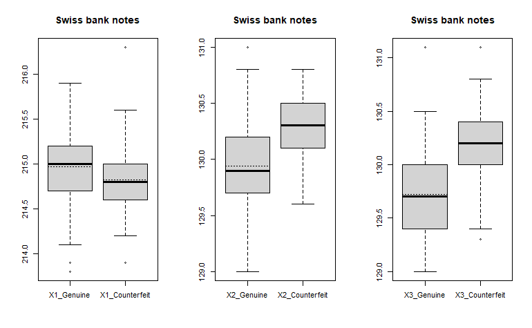
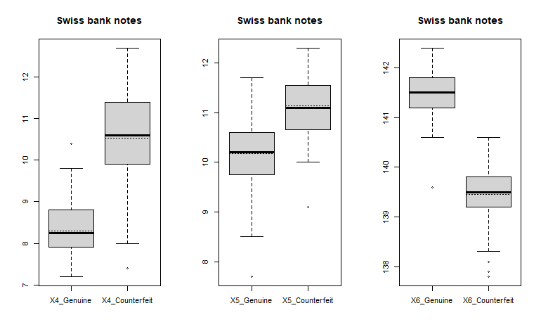
Swiss bank notes 中 X1 、 X2 與 X3 的盒狀圖。
Swiss bank notes 中 X4 、 X5 與 X6 的盒狀圖。
各圖中虛線為該筆資料的平均值,實線為第二四分位數(中位數, Q2),盒子的上下限分別為第三四分位數(Q3)與第一四分位數(中位數, Q1)。而上下邊界則為極大值與極小值,但不包含極端值(異常值, outlier)。四分位距(Interquartile Range, IQR)是 Q3 與 Q1 的差,若某筆資料點大於或小於盒子的 1.5 倍 IQR ,則稱其為極端值。
觀察盒狀圖,我們可以發現 $X_1$ 、 $X_2$ 、 $X_3$ 、 $X_5$ 真鈔與偽鈔的盒狀圖差異不大,不適合單獨使用這些變數進行分析;而 $X_4$ 的盒狀圖雖然表明兩者的平均值與中位數差異較大,但真鈔的盒狀圖卻仍有大部份與偽鈔重疊,因此也不太適合單獨分析; $X_6$ 中真鈔與偽鈔的盒狀圖則明顯有所差異,且資料區間幾乎不重疊,適合用於分析與辨別真、偽鈔。
直方圖 (histogram) 直方圖是一種二維的統計圖表,透過將資料分群,並以長條的高度表示每個區間內的資料數量,能夠直觀地看到資料的分佈情況。我們可以在 R 中使用 hist() 繪製直方圖,以下繪製各變數的直方圖,並以藍色與紅色區分真鈔與偽鈔。
 1
 2
 3
 4
 5
 6
 7
 8
 9
10
11
12
13
14
15
16
17
18
19
20
21
22
23
24
25
26
27
28
29
30
31
32
data_Genuine = data[1 : 100 , 1 : 6 ]
data_Counterfeit = data[101 : 200 , 1 : 6 ]
for ( i in 1 : 6 ) {
breaks_seq = seq ( min ( data[ , i] ), max ( data[ , i] ), by = 0.1 )
min_x = floor ( min ( data[ , i] ))
max_x = ceiling ( max ( data[ , i] ))
hist ( data_Genuine[ , i] ,
breaks = breaks_seq ,
col = rgb ( 0 , 0 , 1 , 0.5 ),
border = "blue" ,
xlim = c ( min_x , max_x ),
ylim = c ( 0 , max ( table ( cut ( data[ , i] , breaks_seq ))) + 5 ),
main = "Histogram" ,
xlab = paste0 ( "X" , i ),
axes = FALSE )
hist ( data_Counterfeit[ , i] ,
breaks = breaks_seq ,
col = rgb ( 1 , 0 , 0 , 0.5 ),
border = "red" ,
add = TRUE )
axis ( side = 1 , at = seq ( min_x , max_x , by = 1 ))
axis ( side = 2 )
legend ( "topright" ,
legend = c ( "Genuine" , "Counterfeit" , "Overlap" ),
fill = c ( rgb ( 0 , 0 , 1 , 0.5 ), rgb ( 1 , 0 , 0 , 0.5 ), rgb ( 0.6 , 0 , 0.4 , 0.7 )),
border = c ( "blue" , "red" , "purple" ))
}
gallery_made_with_nanogallery2-2-histogram
從直方圖中,我們可以發現在變數 $X_6$ 中其重疊的部份最少,僅約佔整體的 2% ;而 $X_1$ 中其重疊的部份最多,約佔整體的 73% 。這也表示,相較於使用 $X_1$,使用 $X_6$ 或 $X_4$ 變數進行分類可以得到較高的區分度,因為 $X_6$ 的重疊部份僅占 2% , $X_4$ 的重疊部份僅占 15% ,代表這些變數能更有效地區分真、偽鈔。而 $X_1$ 的重疊部份高達 76% ,則表示 $X_1$ 在區分不同類別時的表現較弱,。因此,選擇 $X_6$ 可能會帶來較好的辨識真、偽鈔效果。
核密度估計 (kernel density estimation, KDE) 核密度估計是一種用於估計隨機變數的機率密度函數(probability density function, PDF)的方法。對於資料集中的每個數據點,核密度估計以一個核函數(kernel function)為基礎,繪製其局部分佈,並將這些局部分佈累加形成整體的估計密度函數。比起直方圖,核密度估計能提供更平滑且連續的分佈曲線。
假設 $x_1, x_2, \cdots, x_n$ 是獨立同分佈(independent and identically distributed, i.i.d.)的樣本,我們可以經由以下公式估算核密度:
$$
\hat{f}_h (x) = \frac{1}{n} \sum_{i=1}^{n} K_h (x - x_i) = \frac{1}{nh} \sum_{i=1}^{n} K \left( \frac{x - x_i}{h} \right),
$$
其中, $K$ 是非負的核函數, $h > 0$ 為平滑參數(bandwidth)。
本次使用 Biweight 核函數,其公式為:
$$
K(u) =
\begin{cases}
\frac{16}{15} (1 - u^2)^2, & \text{for } |u| \leq 1; \\
0, & \text{for } |u| > 1.
\end{cases}
$$
我們可以使用以下程式碼畫出估計的機率密度函數圖形。
 1
 2
 3
 4
 5
 6
 7
 8
 9
10
11
12
13
14
15
16
17
18
19
20
21
22
23
24
25
26
27
28
29
30
31
32
33
34
35
36
library ( KernSmooth )
for ( i in 1 : 6 ) {
data_Genuine = data[1 : 100 , i]
data_Counterfeit = data[101 : 200 , i]
fh1 = bkde ( data_Genuine , kernel = "biweight" )
fh2 = bkde ( data_Counterfeit , kernel = "biweight" )
x_min = floor ( min ( c ( fh1 $ x , fh2 $ x )))
x_max = ceiling ( max ( c ( fh1 $ x , fh2 $ x )))
y_max = max ( c ( fh1 $ y , fh2 $ y )) * 1.1
x_ticks <- seq ( x_min , x_max , by = 1 )
plot ( fh1 , type = "l" , lwd = 2 ,
xlab = "Counterfeit / Genuine" ,
ylab = paste0 ( "Density estimates for X" , i , sep = "" ),
col = "blue" , main = paste ( "Swiss bank notes - X" , i ),
xlim = c ( x_min , x_max ), ylim = c ( 0 , y_max ),
axes = FALSE )
lines ( fh2 , lty = "dotted" , lwd = 2 , col = "red" )
axis ( side = 1 , at = x_ticks , labels = x_ticks )
axis ( side = 2 )
box ()
legend ( "topright" ,
legend = c ( "Genuine" , "Counterfeit" ),
col = c ( "blue" , "red" ),
lty = c ( "solid" , "dotted" ),
lwd = 2 ,
cex = 0.8 )
}
gallery_made_with_nanogallery2-3-KDE
相較於直方圖 ,核密度估計可以以更平滑、連續的方式來逼近機率密度函數。值得注意的是,無論是核密度估計或是直方圖,選擇合適的 bandwidth 都是影響圖形結果的重要因素,過多或過少的 bandwidth 可能造成圖形過於細碎或粗糙,反而難以出整體趨勢。
使用 $X_1$ 至 $X_6$ 繪製出的核密度估計圖,其藍色曲線與紅色曲線的重疊程度反映了該變數對於分類的判別能力,曲線分離越明顯,該變數對區分真、偽鈔的效果越佳。們可以由圖得到以下結論:
$X_1$ 峰值有一點偏差,但兩條曲線幾乎疊在一起,重疊範圍大,區分效果偏弱。 $X_2$ 峰值有一點偏差,重疊範圍廣,主峰雖不同但差距有限,區分效果偏弱。 $X_3$ 真偽鈔分佈曲線間有差異,峰值區別明顯,區分效果一般。 $X_4$ 真偽鈔的分佈區間分開,重疊少,區分效果極佳。 $X_5$ 真偽鈔分佈形狀和範圍相似,但峰值不同,區分效果一般。 $X_6$ 真偽鈔的分佈區間分開,重疊極少,區分效果極佳。 Andrews’ Curves Andrews’ Curves 借用了傅立葉級數的展開形式,用於多維資料的視覺化,使每筆數據變成一條連續的曲線,便於在二維坐標系中直觀呈現樣本之間的相似性與差異性。
每一個多變量觀測值 $X_i = \begin{pmatrix} X_{i,1} & X_{i,2} & \cdots & X_{i,p} \end{pmatrix}$ 都可以轉換為一條參數化曲線 $f_i(t)$。根據變數的維度 $p$ 為奇數或偶數,其展開形式為:
$$
f_i(t) =
\begin{cases}
\frac{X_{i,1}}{\sqrt{2}} + X_{i,2} \sin(t) + X_{i,3} \cos(t) + \cdots + X_{i,p-1} \sin \left( \frac{p-1}{2} t \right) + X_{i,p} \cos \left( \frac{p-1}{2} t \right), & \text{for } p \text{ odd}; \\
\frac{X_{i,1}}{\sqrt{2}} + X_{i,2} \sin(t) + X_{i,3} \cos(t) + \cdots + X_{i,p} \sin \left( \frac{p}{2} t \right), & \text{for } p \text{ even}.
\end{cases}
$$
註 : $t$ 只是數學映射的輔助參數, $t$ 本身不對應於資料的任何一個維度或變數。
我們可以建構如下程式碼繪製 Andrews’ Curves 。
 1
 2
 3
 4
 5
 6
 7
 8
 9
10
11
12
13
14
15
16
17
18
19
20
21
22
23
24
25
26
27
28
29
30
31
32
33
34
35
36
37
38
39
40
41
42
43
library ( tourr )
x = data[1 : 200 , ]
y = NULL
for ( i in 1 : 6 ) {
z = ( x[ , i] - min ( x[ , i] )) / ( max ( x[ , i] ) - min ( x[ , i] )) # zero-one scaling
y = cbind ( y , z )
}
Type = data[ , 7 ]
f = as.integer ( Type )
grid = seq ( 0 , 2 * pi , length = 1000 )
plot ( grid ,
andrews ( y[1 , ] )( grid ),
type = "l" ,
lwd = 1.2 ,
main = "Andrews' curves (All Bank data)" ,
axes = FALSE ,
frame = TRUE ,
ylim = c ( -0.5 , 0.6 ),
ylab = "" ,
xlab = "" ,
col = ifelse ( f[1] == 1 , "blue" , "red" ),
lty = ifelse ( f[1] == 1 , "solid" , "dotted" ))
for ( i in 2 : 200 ) {
lines ( grid ,
andrews ( y[i , ] )( grid ),
col = ifelse ( f[i] == 1 , "blue" , "red" ),
lwd = 1.2 ,
lty = ifelse ( f[i] == 1 , "solid" , "dotted" ))
}
axis ( side = 2 , at = seq ( -0.5 , 0.6 , 0.2 ), labels = seq ( -0.5 , 0.6 , 0.2 ))
axis ( side = 1 , at = seq ( 0 , 7 , 1 ), labels = seq ( 0 , 7 , 1 ))
legend ( "topright" ,
legend = c ( "Genuine" , "Counterfeit" ),
col = c ( "blue" , "red" ),
lwd = 1.5 ,
lty = c ( "solid" , "dotted" ))
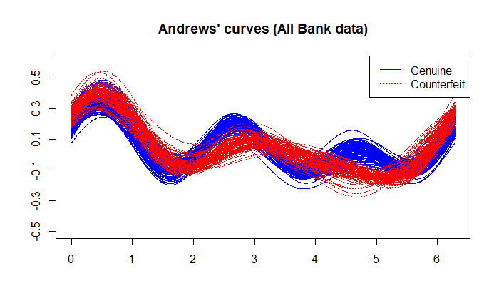
使用 Swiss bank notes 繪製的 Andrews' Curves 。
由上圖的 Andrews’ Curves ,可以觀察到藍色曲線主要集中於中間波動區域,整體較為平穩;紅色曲線在不同區段的變異性較大,波動範圍也較廣。在 $t \approx 2$ 、 $t \approx 4$ 、 $t \approx 6$ ,偽鈔曲線在這些區段呈現較多分散與振幅變動,表示該群樣本之間的差異性較大。
邏輯迴歸 (logistic regression) 對於一般分類問題,我們可以使用邏輯迴歸和隨機森林建立模型。
邏輯迴歸是一種二元分類模型,由條件機率 $P(Y|X)$ 表示,形式為參數化的邏輯分佈。隨機變量 $X$ 為實數,而 $Y$ 取值為 0 或 1 。
對於本資料集的真偽鈔問題,使用邏輯迴歸模型建模,並以 genuine 作爲相依變數(dependent variable) ,$X_1, \cdots, X_6$ 則作爲獨立變數(independent variables) 。本次實作以 70% 訓練集, 30% 測試集。分析如下。
資料分析與模型摘要 簡單的資料分析與模型摘要如下:
 1
 2
 3
 4
 5
 6
 7
 8
 9
10
11
12
# summary
set.seed ( 123456 )
split = sample.split ( data , SplitRatio = 0.7 )
train_reg = subset ( data , split == 'TRUE' )
test_reg = subset ( data , split == 'FALSE' )
logistic_model = glm ( factor ( genuine ) ~ X1 + X2 + X3 + X4 + X5 + X6 , data = train_reg ,
family = binomial ( link = 'logit' ),
control = list ( maxit = 1000 ))
logistic_model
summary ( logistic_model )
 1
 2
 3
 4
 5
 6
 7
 8
 9
10
11
12
13
14
15
16
17
18
19
20
21
22
23
24
25
26
27
28
29
30
31
32
33
警告: glm.fit:擬合機率算出來是數值零或一
Call: glm( formula = factor( genuine) ~ X1 + X2 + X3 + X4 + X5 + X6,
family = binomial( link = "logit" ) , data = train_reg, control = list( maxit = 1000))
Coefficients:
( Intercept) X1 X2 X3 X4 X5 X6
-5619.203 15.488 4.479 -17.391 -15.337 -22.686 30.986
Degrees of Freedom: 113 Total ( i.e. Null) ; 107 Residual
Null Deviance: 158
Residual Deviance: 4.51e-10 AIC: 14
Call:
glm( formula = factor( genuine) ~ X1 + X2 + X3 + X4 + X5 + X6,
family = binomial( link = "logit" ) , data = train_reg, control = list( maxit = 1000))
Coefficients:
Estimate Std. Error z value Pr( >| z| )
( Intercept) -5.619e+03 2.773e+08 0 1
X1 1.549e+01 2.267e+05 0 1
X2 4.479e+00 8.012e+05 0 1
X3 -1.739e+01 1.287e+06 0 1
X4 -1.534e+01 3.596e+05 0 1
X5 -2.269e+01 1.828e+05 0 1
X6 3.099e+01 1.682e+05 0 1
( Dispersion parameter for binomial family taken to be 1)
Null deviance: 1.5800e+02 on 113 degrees of freedom
Residual deviance: 4.5102e-10 on 107 degrees of freedom
AIC: 14
Number of Fisher Scoring iterations: 27
從輸出我們可以看到該模型的 AIC 為 14,其他係數描述如下:
混淆矩陣與 ROC 曲線 我們使用以下程式碼進行預測。
 1
 2
 3
 4
 5
 6
 7
 8
 9
10
11
12
13
14
15
16
17
predict_reg = predict ( logistic_model , test_reg , type = 'response' )
predict_reg = ifelse ( predict_reg > 0.5 , 1 , 0 )
table ( test_reg $ genuine , predict_reg )
missing_classerr = mean ( predict_reg != test_reg $ genuine )
print ( paste ( 'Accuracy=' , 1 - missing_classerr ))
ROCPred = prediction ( predict_reg , test_reg $ genuine )
ROCPer = performance ( ROCPred , measure = 'tpr' , x.measure = 'fpr' )
auc = performance ( ROCPred , measure = 'auc' )
auc = auc @ y.values[[1]]
auc
plot ( ROCPer , colourise = TRUE , print.cuttoffs.at = seq ( 0.1 , by = 0.1 ), col = 2 , lwd = 2 , main = 'ROC Curve' )
abline ( a = 0 , b = 1 )
auc = round ( auc , 4 )
legend ( .6 , .4 , auc , title = 'AUC' , cex = 1 )
1
2
3
4
5
6
predict_reg
0 1
0 42 0
1 1 43
[ 1] "Accuracy= 0.988372093023256"
[ 1] 0.9886364
混淆矩陣顯示,該模型對兩個類別都具有高度準確的分類。對於偽鈔(類別 0 )具有完美的分類率;對於真鈔(類別 1 )的錯誤率非常低。
使用邏輯迴歸的 ROC 曲線。
ROC 曲線( Receiver Operating Characteristic curve )能呈現分類器在效益(真陽性率)與成本(偽陽性率)之間的相對關係。AUC ( Area Under Curve )代表在 ROC 曲線下的面積,能表示分類器預測能力的一項常用的統計值。
ROC 曲線的 AUC 為 0.9886 ,證實了邏輯迴歸模型在對鈔票進行分類的測試集(86 個觀測值)上表現非常出色,與混淆矩陣一致(準確率為 98.8%,TPR = 0.977,FPR = 0)。
指標 計算方式 結果 類別 1(正類)錯誤率 FN / (TP + FN) 1 / 44 ≈ 2.27% 類別 1 的敏感性(召回率 Recall) TP / (TP + FN) 43 / 44 ≈ 97.73% 類別 0 的錯誤率 FP / (TN + FP) 0 / 42 = 0% 類別 0 的特異性(Specificity) TN / (TN + FP) 42 / 42 = 100%
隨機森林 (random forest) 隨機森林是由許多不同的決策樹所組成的一個學習器,其原理是結合多個「弱學習器」建構一個更強的模型。「強學習器」的基本原理是,結合多棵 CART 樹並加入隨機分配的訓練資料,以改進運算結果。
資料分析與模型摘要 簡單的資料分析與模型摘要如下:
 1
 2
 3
 4
 5
 6
 7
 8
 9
10
library ( randomForest )
# summary
set.seed ( 12345 )
data $ genuine = as.factor ( data $ genuine )
split = sample.split ( data , SplitRatio = 0.6 )
train_rf = subset ( data , split == 'TRUE' )
test_rf = subset ( data , split == 'FALSE' )
rf = randomForest ( genuine ~ X1 + X2 + X3 + X4 + X5 + X6 , data = train_rf , ntree = 500 )
print ( rf )
 1
 2
 3
 4
 5
 6
 7
 8
 9
10
11
Call:
randomForest( formula = genuine ~ X1 + X2 + X3 + X4 + X5 + X6, data = train_rf, ntree = 500)
Type of random forest: classification
Number of trees: 500
No. of variables tried at each split: 2
OOB estimate of error rate: 0.88%
Confusion matrix:
0 1 class.error
0 56 0 0.00000000
1 1 56 0.01754386
從模型的表現我們可以看出 0.88% 的 OOB 錯誤率表示效能優異。平均每 113 個預測中只有 1 個是錯誤的。
混淆矩陣顯示,該模型對兩個類別都具有高度準確的分類,對於類別 0 具有完美的分類率( 0% 錯誤率),對於類別 1 的錯誤率非常低( 1.75% )。
重要變數 1
2
importance ( rf )
varImpPlot ( rf )
1
2
3
4
5
6
7
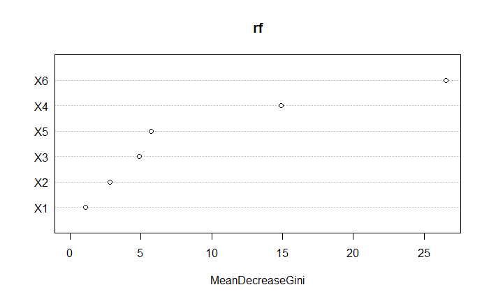
   MeanDecreaseGini
X1         1.078579
X2         2.833452
X3         4.902606
X4        14.906531
X5         5.751345
X6        26.515655
隨機森林的特徵選擇。
根據特徵選擇來看,我們可以發現 $X_6$ 和 $X_4$ 的影響最大。 其他特徵都落 0 ~ 10 之間。
ROC 曲線 1
2
3
4
5
6
7
8
9
10
11
pred1 = predict ( rf , test_rf , type = 'prob' )
perf = prediction ( pred1[ , 2 ] , test_rf $ genuine )
auc = performance ( perf , 'auc' )
auc_value = auc @ y.values[[1]]
pred3 = performance ( perf , 'tpr' , 'fpr' )
plot ( pred3 , main = "ROC Curve for Random Forest" , col = 2 , lwd = 2 )
abline ( a = 0 , b = 1 , lwd = 2 , lty = 2 , col = 'gray' )
text ( 0.6 , 0.2 , paste ( "AUC =" , round ( auc_value , 3 )), col = 2 , cex = 1.2 )
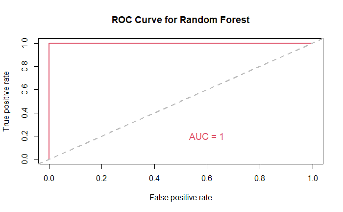
使用隨機森林的 ROC 曲線。
ROC 曲線和 AUC = 1 表示隨機森林模型是該資料集的完美分類器,實現 100% 的真實陽性率和 0% 的假陽性率。
運行環境 作業系統:Windows 11 24H2 程式語言:R 4.4.2 延伸學習 參考資料 

的資料集。本文自 https://github.com/QuantLet/MVA/tree/master/QID-1530-MVAscabank56 中下載 bank2.dat 資料集,並使用 R 語言進行分析。")